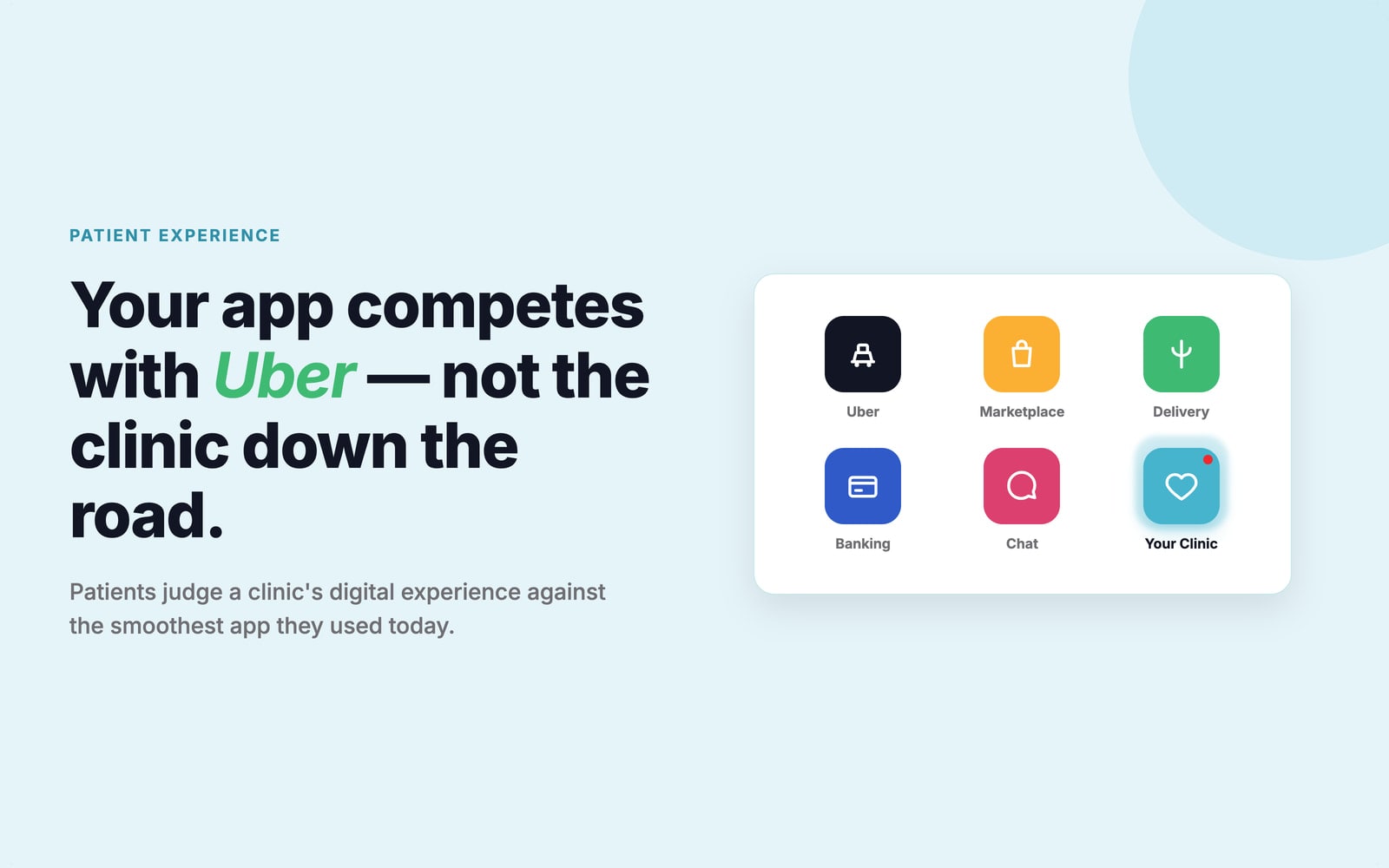
Most patients aren't comparing your clinic's app to the clinic down the road. They're comparing it to Uber, to their banking app, to every fast, three-tap experience they already use without thinking. That's the bar for patient experience now - not what other clinics do, but the smoothest thing the patient used before opening yours.
It's an uncomfortable truth for an industry that's often treated its digital experience as an afterthought. But it's also an opening: most clinic software is a chore to use, so the few that get it right stand out immediately. Here's where the friction hides, what it costs, and what a good patient experience actually looks like.
The gap costs clinics real patients
It's easy to file a good digital experience under "nice to have." The numbers say otherwise, and they've only gotten starker since anyone first raised the alarm. Back in 2020, Cedar's Healthcare Consumer Experience Study found that 28% of patients had already switched providers or stopped going altogether over a poor digital experience - a 40% jump in a single year. That was the warning shot. The picture since has only sharpened: nearly 80% of patients who switch providers now point to navigation and access problems, and a 2025 survey found 69% of patients would switch providers for a better experience, with 82% giving a provider only one or two chances before they do.
The overwhelming majority of patients who leave aren't leaving over clinical care or price - just how annoying the software was. Losing a patient to a clunky booking flow isn't a rare misstep anymore. It's close to the default outcome if the digital experience doesn't hold up.
Where the friction hides
The form that asks the same thing twice
A patient enters their details to register, types half of them again at check-in, then repeats a third time on a clipboard in the waiting room. Every repeated field is two systems that don't talk to each other. Good intake forms capture information once and reuse it - onboarding should feel like moving forward, not going in circles.
The separate link for the video visit
The patient books in one place, then a different link lands in their inbox for the video call - different login, different app. Every handoff is a chance to lose them. When telehealth lives inside the same app as everything else, the visit is one tap away, not a second system to figure out.
The password reset that loops
Nothing kills trust faster than being locked out of your own health records. Separate logins for booking, records, payments, and messaging mean more passwords, more resets, and more people who simply give up.
The booking that takes six screens
A booking flow that sprawls across six screens when two would do is where appointments quietly don't happen. Every extra step loses a few more people. See the slots, pick one, done - a flow that short leaks far fewer patients than one that doesn't.
What a good patient experience looks like
Fixing this isn't about a prettier interface - it's about starting from what the patient is trying to do and stripping out everything in the way. A few principles separate the clinics that pull it off.
One front door, one login
The best patient access point is a real digital front door - one branded entrance where booking, records, messaging, payments, and virtual visits all sit behind a single login. That's only possible when the systems underneath are actually connected, not just placed side by side.
Designed for a phone, and for everyone
Most patients meet you on a phone, so mobile-first isn't a nice extra - it's the main event. And accessibility isn't optional in healthcare: the patients who need care most - older patients, people with disabilities, people working in a second language - tend to have the least patience for friction. Screen-reader support, readable type, and plain language widen the pool of people a clinic can actually serve.
The whole journey in one place
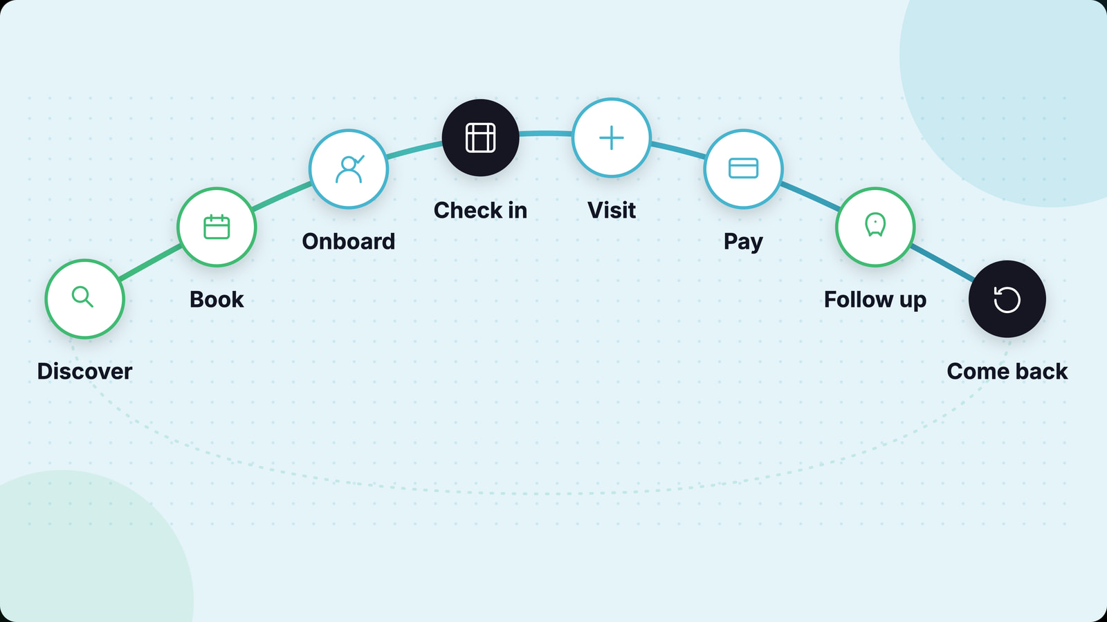
A good patient experience treats the journey as one continuous arc, not a string of disconnected transactions: discover, book, onboard, check in, visit, pay, follow up, come back. When those steps flow into each other, the patient never has to stop and wonder "okay, what now?"
An operational lever, not a coat of paint
A better digital experience isn't a design-team ticket - it moves the numbers a clinic already tracks. Easier booking means more completed bookings and fewer abandoned ones. Secure messaging and easy rescheduling cut no-shows, because someone who can move an appointment in two taps does that instead of ghosting. Smoother onboarding and follow-up lift retention, because the small frictions that make patients drift off are gone.
And the reason so much clinic software feels bad to use is usually an integration problem in disguise: when booking, records, payments, and messaging are separate products stitched together, no amount of polish on any single one closes the gaps a patient falls through. The products that actually feel good are built as one connected platform from day one, not stitched together after the fact.
The takeaway
Patients grade a clinic's digital experience against the best app they opened today, and a real share of them will leave over it. The clinics that win treat it as what it is - an operational lever tied directly to bookings, retention, and outcomes - built on one connected, mobile-first platform with a single login, not a pile of disconnected tools.
That's the idea behind Holty: one branded patient app where booking, telehealth, payments, records, and follow-up all sit behind a single experience, connected to the systems a clinic already runs. See the patient app, or book a 15-minute demo and see how it fits yours.
See what this looks like on your own clinic
Fifteen minutes, your patient journey, no slideware.
Frequently asked questions
What is patient experience in a clinic's digital tools?
It's how patients experience booking, records, messaging, payments, and virtual visits. A good digital experience starts from what the patient is trying to do and clears the friction at each step, so it feels as easy as the consumer apps they already use.
Why does digital experience matter in healthcare?
Because it decides whether patients stay. Recent research shows close to 80% of patients who switch providers cite navigation and access problems, and a 2025 survey found 82% of patients give a provider only one or two chances before leaving over a poor experience.
What makes a good patient access platform?
A single digital front door with one login, mobile-first and accessible design, simple navigation, and real integration - so booking, records, payments, and virtual visits connect into one experience instead of a patchwork.
How does digital experience affect retention and no-shows?
Friction makes patients leave, and it makes them skip appointments. Remove it - two-tap rescheduling, one login, easy follow-up - and people reschedule instead of no-showing, and come back instead of drifting off.
What's the role of accessibility?
Central, not optional. Inclusive design widens the group of people a clinic can serve, since the patients who need care most often have the least patience for a confusing interface.